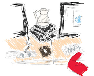
For both of these two teapots, I used the paintbrush and pencil tool in Illustrator.
I made multiple lines in order to give the teapots depth and volume.
On the subject of drawing it, I simply drew what I saw.
I didn't plan the illustration in any specific order.
In order to make this teapot, I used the "Pen & Point" tool.
This caused my lines to be much sleeker, and more abrupt.
However, I think the teapot illustration looks neater as a whole
For both this teapot illustration and the one below,
I used the concept of layering to complete my illustration.
I started by illustrating the background, and continued
forward until the illustration was complete.
I used the paintbrush tool, as well as an artistic stroke to illustrate this teapot.
It was a very "curvy" teapot, so I found this tool to be extremely effective.
Just as the above illustration, I layered this teapot illustration,
beginning with the background, and moving to the foreground.
**All the colors and backgrounds in these teapot illustrations
were meant to be replicas of the actual situation.
My main focus for these illustrations was to be consistent with certain things,
and altering other components.
My "rules" for this set of illustrations were as follows:
Monochromatic color scheme
Black & White "8 Ball"
Constant Stroke
The only component that changes within these illustrations
is the color scheme of the background objects.


